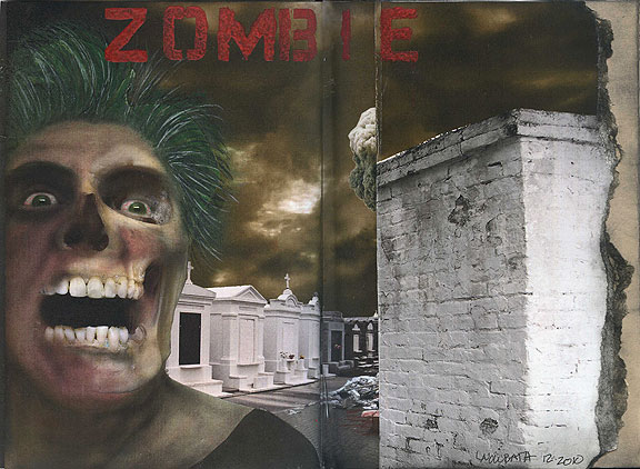
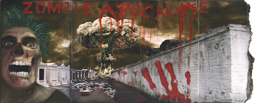
 This week, I finally got all my digital ducks in a row, and put together the Zombie Apocalypse layout in Corinne’s altered book. And a big, fat layout it is—21 inches wide when unfolded.
This was a lot of work. A lot of work. Don’t let the digital artwork fool you—it takes hours to put something like this together, and make all the pieces and parts fit properly, land in the folds exactly where I need them, and then print them and assemble them as I’ve laid them out on screen. I think I worked on screen for three evenings to get all the files ready, and then one to put them together, and another to do painting, stenciling and touch up work. This is why I get very annoyed with people who think there’s something easy about doing digital work, or that using PhotoShop is somehow a short cut. It really would be faster to haul out my paints, but somehow, painting this would have taken away from the sort of creepy monster movie poster quality it as. I’m pretty happy with it, even if I did blow the spacing on a couple of things.
And hey, how many times to you get to turn yourself into a zombie? Lacking a decent model, or a photo of Corinne, I snapped one of myself. That’s me, zombiefied, and also my red hand print. That should give Corinne a chuckle…
